

- cross-posted to:
- fuckcars@lemmy.world
- fuckcars@lemmy.ca
- cross-posted to:
- fuckcars@lemmy.world
- fuckcars@lemmy.ca
You must log in or register to comment.
Link to article?
An entire continent is missing.
There are no buses in Antarctica, silly
0% cars, 0% public transport, 30% walking/biking, 30% swimming, 40% belly tobogganing

Also excluding Mexico for some reason.
Mexico is part (most) of Central AmericaI was mistakenalthough wrong I think it would make more sense
Mexico is part of North America…
It is, but read the small font: it says they excluded Mexico from their North America stats.
oh. lol.
Maybe they put it under Central America, which is all north america technically.
More than one!
Three of them, though I don’t know how much biking people are doing in Antarctica.
Fun fact: there’s no universally-accepted definition of “continent!” Depending on how you define it there could be as many as 8 or as few as 4. Sometimes Africa, Europe, and Asia are counted as one continent, and sometimes Antarctica isn’t (notably in the Olympic flag). Sometimes Zealandia is added as the 8th continent. All the definitions I’ve seen count Australia as its own, though; and as noted that one’s missing.
All of that to say, the original commenter might have an Afro-Eurasian non-Antarctic model in mind when they say that one entire continent is missing. The second one might have a non-Antarctic six-continent model in mind, and you have the traditional (English-speaking) seven-continent model in mind. But you might very reasonably (well, okay, slightly reasonably) say that this infographic is missing four continents: Africa, Australia, Antarctica, and Zealandia.
I’ve often seen Australia included in Oceania.
Oceania is a useful geographic region, but I haven’t seen anyone include it as a continent; the most common definitions I’ve seen for continents are “lands sitting on the same tectonic plate” (so, the geological definition) and “contiguous land of a sufficient size not broken up by any ocean.” Interestingly, both of those definitions still allow some wiggle room in what counts and what doesn’t, but in either definition, Australia is not part of the South Pacific islands.
I thought Oceania was just another name for Australia?
It normally includes the myriad of islands of the Pacific, New Zeland, and maybe Papuasia.
Side note, I just realized that the continents alphabetize really strangely, if you combine the Americas:
Africa Americas Antarctica Asia Australia Europe
The letter A is way overrepresented in the names of our continents.
For the glory of A, Europe shall now be renamed to Aurope!
More proof the Atlantis continent was real!
You finally unlocked my mind, I get it now
I need to know how the penguins commute
They waddle or swim! They used to drive until the Heard and McDonald Islands got tariffed :/
Driving cars is important to the economy.
when you definitely understand what words mean
It is important to be miserable and waste resources so that the rich can get richer. The benefits will come when trickle-down economics start working. We’ve just got acid rain so far but there will be money falling from the sky any moment now.
the economy is made up to distract you so they can destroy communities for profits.
Two economists are walking in a forest when they Come across a pile of shit.
The first economist says to the other “Ill pay you $100 to eat that pile of shit.” The second economist takes the $100 and eats the pile of shit.
They continue walking until they come across a second pile of shit. The second economist turns to the first and says “l pay you $100 to eat that pile of shit.” The first economist takes the $100 and eats a pile of shit.
Walking a little more, the first economist looks at the second and says, “You know, I gave you $100 to eat shit, then you gave me back the same $100 to eat shit. can’t help but feel like we both just ate shit for nothing.” “That’s not true”, responded the second economist. “We increased the GDP by $200!”
What that joke is missing is the fact that the $200 is taxable income so the government and its citizens would benefit from that transaction.
IF you had a functional social safety net, however in this circumstance you would eat shit, pay taxes, a family in Palestine would die, and a rich person would have a couple extra dollars towards the next extravagant pedophilia convention in Florida
Maybe Ukraine would be given a missile to defend itself.
I’d be okay with that.
Sorry, all you get is a Ukraine that is in debt for the next 100 years as Euro-American megacorporations pillage the land and opportunists purchase its women and children for their own satisfaction. The men, of course, are sent as mercenaries into a neverending meatgrinder against whatever enemy we decide they should fight this week.
Yes of course. In reality, capitalists would take 40% of that GDP produced and the state another 20%. So you’d be left with 40% of the “value” you produced while eating shit.
Another reason why measuring economic success in GDP is stupid.
It’s better to measure wealth disparity.
I myself would favour to use:
• median net discretionary GDP (PPP) per capita
• generalised entropy index
• Social Progress IndexThe first one yields that 50% of the population can buy more or less than a certain amount of stuff, after tax and regular expenses.
The second could be used for wealth disparity. Unlike the Gini index, it allows you to view differences by groups.
The third is very broad and does not use economics, instead focusing on general wellbeing. Some criticism I have on the index though, is that on regards of inclusivity, it doesn’t include the (very good) Asher Fergusson index for trans rights. LGBTQ+ isn’t just gays and lesbians, it’s all queer people.
I’d also add in the Copenhagenisation index for bicycling, alongside with indices for pedestrian and public transit-friendliness.
For countries occupying other areas, count those areas both separately and include them in that country’s statistics. So then Israel’s statistics are actually honest: the inequality is extremely high, life expectancy very low, and so on.
To top it off, within the safety part of the social progress index, I’d include the detained population as a rate of the total, perceptions of state (and hybrid) violence, as well as extent of surveillance, police and para-military, armedness.
Oh, and it’d be better to have sources be independent from state and corporatist actors.
Upvoted because I’m all but certain this is sarcasm flying under the radar. Like, I’ve seen you around (your name name is pretty hard to forget), and generally you have good takes. Chaotic, but that’s not a bad thing.
We really need a widely used subtle sarcasm indicator
Which country’s economy?
America, the greatest nation in the galaxy.

No, transportation in general is. Cars are by far the least efficient form of transportation and therefore the worst for the economy.
The worst until we get to private jets and helicopters
It’s honestly insane. Half of regular travels in the world is done using huge machines 10-20X the weight of humans inside.
People get to carry a giant piece of metal around and they think it’s okay.
Hello! Australia is a thing! We get around just as much as everyone else does, thank you very much! I’ve got the emu feathers to prove it!
charts without New Zealand
I’m no mapologist, but I believe Austria is included in one of the Europe sections.
I didn’t know Hitler was from the land down under
Crickey mate, put another undesirable on the barby?
They’re called prawns. Hoges only said ‘shrimp’ at the time because the tourism board figured Americans wouldn’t know what prawns were. But, by God, you come here, you speak our language, dammit! Don’t make me get the man from Ironbark!
Where women snore and men chunder?
You thought he’d be from Denmark like Hamlet?
he is strange and makes me nervous. i’m not eating his breakfast tho
I see you speak my language
Australia
Austria
lmao
I think the Mexico data is really off, but at the same time I have seen several cities (like Culiacan, Mexicali, and Guadalajara) where the price for public transport has gone way up while making the service quality worse (fewer buses, fewer routes, no AC on summer)
so it would not surprise me if usage keeps going down over time
Weird to exclude mexico
The cultural distinction between US+Canada and the rest of the Americas (usually called Latin America despite Jamaica), which is the divide they probably used, makes for more distinction in most metrics than the geographical division. Similarly, most polls about “Europeans” exclude Ukraine and Belarus, not to mention the Western parts of Russia, Kazakhstan and Turkey.
Brother you realize you could have more than one sentence per comment right?
Why many when few do trick?
Me: stays in basement
Is biking including motorcycles?
“Cars” includes “Cars, SUVs, pickup trucks, taxis, and mobility apps (like Uber and Lyft). The category also includes motorbikes.”
Where does it say that?
I took a look at the cited paper. Table 2 was used for this graphic. It’s from the paragraph right above it
Now do urban, suburban, exurban, rural splits.
I looked at it and the study is only considering cities. I wonder why whoever made the chart omitted Mexico since it is included in the original study?
The researchers for this study put together a neat data explorer at citiesmoving.com
What about Africa ?
Everything is within walking distance for them due to Mercator contraction.
The North America stat is fine if you’re only talking about the US and Canada… but since they left Mexico out it’s not really accurate
They may have lumped it in with Central America.
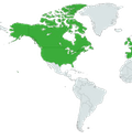
Boo! Mercator!
Make the one map but on equal earth projection. Will finally fix the “the majority of countries” feeling which it gives.
Adding Mexico would skew the data, probably.
‘skew the data’… with facts? about North America?
As opposed to cherry picking data to present their preferred narrative?
If Mexico’s stats are much closer to the rest of Central America, then it makes much more sense to count it with them, so the outlier of North America is better seen.
I think they’re trying to tell a story about the way cities in the US and Canada are brutally malformed for moving people around in them. Mexico is much more like Central America in its modality, and so adding their stats in obscures the abnormalities that are the US and Canada.
Unless I’m missing something, there’s no mention of cities.
The closest grocery store for me is a 20 minute drive. Of course I drive. There aren’t too many buses running around the woods of northern New England.
I’m not saying that the numbers are not still pretty bad. Boston has way too many cars. New York did an awesome thing with congestion pricing. But sometimes public transport doesn’t make sense for the area.
I would like to see a graph that just shows major metropolitan areas. I’m sure the US still sucks but you can’t include households that are many miles from any store at all and use that to skew the numbers.
Also, why exclude Mexico and then call it North america. Why not call it Canada and the US? Why not label Canada and the US separately? These numbers are pushing an agenda. I’m not saying the agenda is wrong but this graph seems a bit dishonest.
You’re right, this graph isn’t specifically about cities; it’s just that cities are currently the biggest transit problems in the US.
I would like to see a graph that just shows major metropolitan areas.
The org that did this research also has a visualizer tool where you can compare different cities around the world, and you can see that even new York City has something like 65% of its population using personal cars. And it’s by far the most multimodal city in North America; Ithaca gets close, because they have a robust cycling culture, and there are more Canadian cities in the hunt than US cities, but it’s still unbelievably skewed in favor of personal cars. Which means that, even if you excluded all rural areas from this graph, North America would still be dramatically anomalous.
you can’t include households that are many miles from any store at all and use that to skew the numbers.
I think that the reason that the graph doesn’t exclude rural areas from its data is that the density of North America isn’t dramatically different from the density of Europe or Asia. Yes, the US is slightly less dense than the world average, but not excessively so; and there are plenty of countries in those other continents with lower density than the US or Canada. In fact, Canada is quite a bit less dense than the US, but it’s pulling North America’s multimodality up. So no, you can’t use it to skew the numbers–but I mean that in the sense that you’re unable to do it, it’s impossible, because it’s affecting the numbers worldwide in more or less the same way.
Also, why exclude Mexico and then call it North america. Why not call it Canada and the US? Why not label Canada and the US separately?
Better readability, is my guess. The only divisions in this infographic that really matter are the political ones, because those are the divisions that affect the data in a meaningful way. So cutting out Mexico is no more arbitrary than cutting out Canada would’ve been.
These numbers are pushing an agenda.
All numbers are pushing an agenda.
Ok, not all numbers, but there’s no real reason to gather demographic research data otherwise. We do censuses and polls and studies to figure out what to do as a society. That’s why we do that. The numbers are telling a story, and it’s not a false story: multimodality in the United States and Canada is dramatically lower than in other countries around the world. Cities in North America don’t serve their citizens as well because their citizens don’t have as many options for how they get around.
Sure, they could use this data to highlight how multimodal transportation in Eastern Europe is, but that’s just another way of pointing out how one-sided it is in North America. Or you could use it to show how dominant public transit is in East Asia, or biking in South Asia, but again, they would just be another way of showing how anemic it is in the US.
And when you’re an organization called “Environment International,” that’s the story you’re trying to tell. They’re just slicing it up in a way that makes the story clearest.
I’m not saying the agenda is wrong but this graph seems a bit dishonest.
It’s not dishonest. It’s being pretty up-front about showing a huge disparity, and it’s not trying to hide the fact that they’re cutting out Mexico to show that there’s a serious problem in the US and Canada. It’s like if you took a photo of a purse-snatching in progress, and you cropped in to show the crime occurring. No one would accuse you of lying because you cropped out the kid getting a treat from the ice cream truck on the right-hand side of the frame; you just made it more clear what you were trying to show with that photograph.
How did they get an average of 51% for cars, when all but one bar is below that?
First off “Africa” (22.2% cars) and “Australia and New Zeland” (75.9% cars) are not shown. But probably more important: The paper where the data is taken from used the traffic data from 794 cities, “weighted by the population of each observation”. Most probably there were more cities from regions with high car usage in the data.
Interesting side fact: “The 794 cities in the data are not representative samples of cities worldwide or different regions”.good answer
weighted averages.
Through extremely heavy use of cars in Africa of course.
Everyone knows that in Africa people get around in cars 24/7 100%.
North America, only place with higher than 50% by car, brings the world average to 51%?!
Southern Africa has 65%, and Australia and New Zeland has 75.9% (from the source on ScienceDirect)
There’s no way only 8% of people in South Africa walk. There’s something wrong with how they’re collecting the data.
Walking is the most common mode of transport used in the country, with about 17.4 million South Africans walking to their various destinations, followed by 10.7 million individuals who made use of taxis and 6.2 million who used car/truck as a driver.
Anyone who actually lives here can confirm walking is the primary mode of transport. Not because the infrastructure facilitates it, because it doesn’t, but rather out of financial necessity.
Cape Town is 4% active, 82% car, according to their visualization
Cape Town is not representative of the rest of the country (it’s the wealthy city) and only has about 8% of the population. The visualization doesn’t have data for the more representative cities, i.e. Johannesburg, Durban (eThekwini), Germiston (Ekhruleni) and Pretoria (Tshwane), which collectively have 3-4 times the population and I believe are the most likely contributors to the high walking figures found from the National Household Travel Survey (2013).
The Spiders Georg of car dependence
How is Europe split? Germany is rather central. Does it Count as north or west europe? South? Probably nor east. Or is Germany divided again for this analysis? Resembling post-WWII times.
All 154 german cities in the data are listed as western Europe
@Zacryon @dessalines normally central Europe. Here I’d assume its counted as western Europe
Germany is in the western half of Europe