My face when OP calls this the worst:
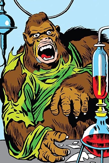
This is clearly a masterpiece.
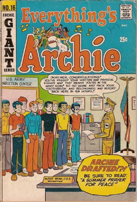
Surely not the best but not the worst. then again it’s “the worst you’ve ever seen”, maybe you have seen OP and this one in total.
Who’s that one artist who draws notoriously bad female anatomy? I think he also did that weird Captain American who’s chest is like a cubist drawing a body builder
rob liefeld
…and every other drawing tutorial I’ve been a part of, it clearly says that every line you draw on a person’s face adds to their age. When you’re drawing children or sexy young women you give them clean surfaces to suggest youth and a tightness of veins…
So that’s why women don’t have noses in xmen classic
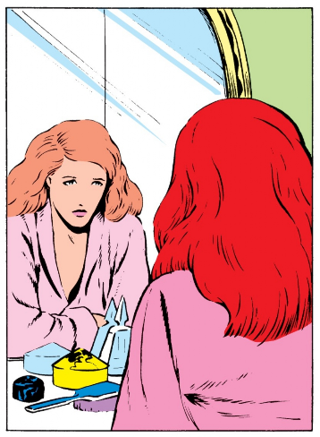
I like how the colorist for #40 was still like “I’ve got a job to do and I’m gonna do it!”
And can’t draw feet
https://www.pipelinecomics.com/rob-liefeld-doesnt-draw-feet/
That’s actually a good article defending him, with comparisons to other artists.
Liefield did nothing wrong is my new mantra.
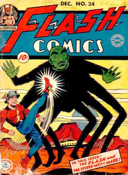
BurntFace Man kicking ManSpider in the ghoulies whilst ObservationBoy watches
While Ziggy jived them that they were voodoo.
About 20 years ago, there was a website devoted to Batman covers demonstrating that he was a jerk. I printed a bunch of them and hung them up at work. Boy, I wish that website hadn’t disappeared. It was great fun.
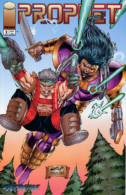
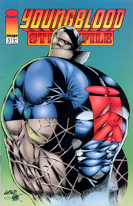
If looks could kill
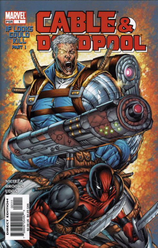
I’m going to catch a lot of flak for this, but I like this guy’s style, I honestly do. You can add it to my other terrible opinions, like thinking Battlefield Earth is an enjoyable film.
My main beef with Liefield is that his tryhard edgy “what if everyone grimacing with goofy guns and goofy knives” thing started to effectively dominate the comic book zeitgeist for years. Was exhausting.
Yeah I can see how that would be annoying. My only experience of his work is people dunking on him. Although I’ve read those two very famous internet posts breaking down all his very worst offences, my immediate impression was how the proportions in his drawings reminded me of post WW1 modern art.
For whatever reason I liked the impressions his artwork gives. Although in many cases I can agree that it is lazy and looks bad.
Leifeld is cheating!
This cover kinda slaps
When your one friend gets too turnt
I don’t know if it’s the worst or best I’ve ever seen, but Sonichu
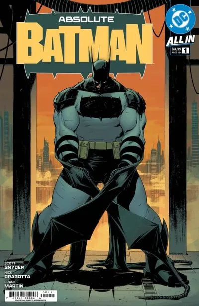
This one is awful! Batman’s head is so tiny. Compare his head to the size of his feet and legs. The proportions are so awful they make me feel uncomfortable looking at it.
His thighs and boots feel like the episode of Doug when we got “cool” shoes. https://doug.fandom.com/wiki/Doug’s_Cool_Shoes
Absolute unit batman
i cant remember what comic it was, or if there are multiple like it, but it had the main character fighting wolverine then in some text to the side said wolverine will not be in this issue
Rob Liefeld. Any of them
Elftor

