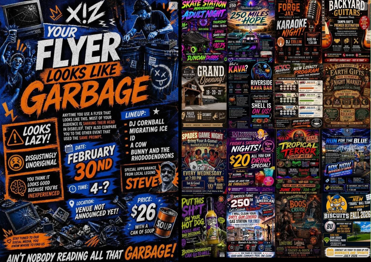
I see these everywhere and I fucking hate them.
My work unintentionally ironically used an AI flyer to promote an art show. Everyone in management is besotted with it.
Man, they do all look just like that. There’s one promoting some kind of event on the college campus near me. Like, you couldn’t find someone to design a poster on a college campus? It isn’t a student group that made it, the university itself did.
It’s this era’s WordArt.
WordArt was art. This is AI slop.
I remember the early days of desktop publishing. Before that people couldn’t easily use multiple fonts or sizes. After, at least for a while, everything looked like a ransom note.
There was a hideous copper to light blue gradient option that my school district loved
Honestly if we brought back the ransom note aesthetic, people might find it a breath of fresh air compared to the low effort chat gpt posters they see today.
Been noticing every YouTube thumbnail with these boring designs. Like 80% of my feed uses these. All they do is change the color palette. Same brush stroke letters.
It’s god awful.
What I did is just turned off history and delete past history, disabled google-wide ad personalizations. It refuses to show me a front page and I do frequently clear YT and Google cookies using the icon in the address bar in my browser, but I don’t end up in any weird niche recommended algorithms at least. The only sloppified thumbnails I ever click would be Legal Eagle.
Anyone got a version that doesn’t require me to sign up?
I’m surprised, this pm it was free. Ho anyway
Thanks friend
I want to name my band Bunny and the Rhododendrons now.