Servais (il/le)@discuss.tchncs.de to YUROP@lemm.ee · 2 months agoPopulation size of European Countriesfiles.catbox.moeimagemessage-square12fedilinkarrow-up168arrow-down10
arrow-up168arrow-down1imagePopulation size of European Countriesfiles.catbox.moeServais (il/le)@discuss.tchncs.de to YUROP@lemm.ee · 2 months agomessage-square12fedilink
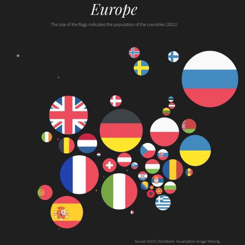
minus-squareVincent@feddit.nllinkfedilinkarrow-up16arrow-down1·edit-22 months agoKeep in mind that we’re notoriously bad at comparing the sizes of circles. (Which is also why pie charts aren’t great.) For example, Spain’s population is more than 2.5 times that of the Netherlands.

Keep in mind that we’re notoriously bad at comparing the sizes of circles. (Which is also why pie charts aren’t great.)
For example, Spain’s population is more than 2.5 times that of the Netherlands.