Just… why??
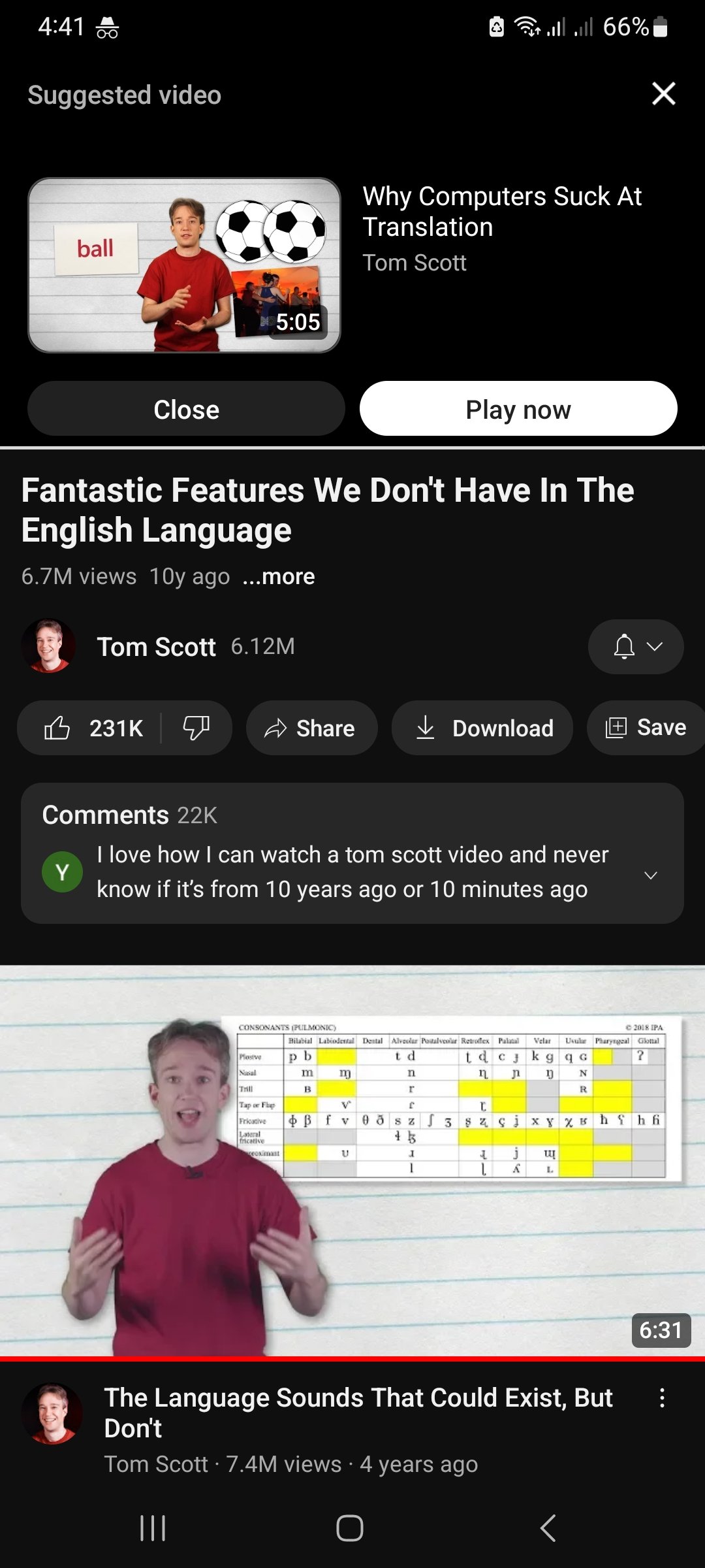
At least (in this case) it’s making reasonable suggestions. Watch Tom Scott -> Here’s another Tom Scott video you haven’t seen. Even so, the GUI in the app has just become a complete mess. I don’t use it too often, but it feels like they redesign it in between every time I do.
I’ve seen some other cases where it’s not so reasonable. For example, after watching what is basically the Sega jingle for a 2009 video game, it suggests me a Cinemassacre video about why Blu-ray sucks (a video that I’ve already watched before that point). And sometimes I wanna go back 10 seconds and accidentally click on the suggested video that I don’t wanna watch, which is pretty annoying.
deleted by creator
…now? Bud, they’ve done this for ages, both on mobile and desktop how the hell have you not noticed it? It used to be even more obvious on desktop because they’d put it up as the first item in the ‘related videos’, but they got rid of that so now you don’t know what it’s going to start autoplaying until it happens, which is mildly annoying when you’re listening to music and can’t see what’s up next
Yeah I have to be honest, I know they’ve been doing this for ages, but I’ve never seen them doing it in this form until now.
It’s fine. What I cannot stand is showing suggested content in the damn search results.
Yes search results, you search “how to install a water heater” and would get a video about how to inspect a house with small line says “people also watched this”
Fuck YouTube CEO.
Search: apples
People also watch this: The golf ball paradox
I can definitely relate
I moved into a new place and I’ve heard it’s a good idea to flush out you water heater at least once a year. So I looked up how to do that on YouTube. Found a good video after maybe 1 or 2 that weren’t great, but I got it done.
Then YouTube is like “OH THIS GUY LOVES WATER HEATERS??? HERES SOME MORE VIDEOS ABOUT THAT!!!”
The same for any shopping ads.
“Oh hey you bought this item that you only need one of? Here’s ads for it for three months?”
Ryan George did a take on this
Here is an alternative Piped link(s):
https://youtu.be/d8fJPvXyfc0?si=5JkkdD110r6cmaFE
Piped is a privacy-respecting open-source alternative frontend to YouTube.
I’m open-source; check me out at GitHub.
The classic UGH of YouTube.
You could heat it over 60C too
Incognito helps
I miss pre-google YouTube
Ok Grandpa it’s time for your nap
I just got up from my nap, whippersnapper
Uh oh, stay clear of this feisty mf for the next eleven minutes
What do you have against amateur porn?
Pre-google youtube only existed for a year and it wasn’t that great. What I miss is the early Google era. 2007-2010
Its more ridiculous when you search a thing.
- Some Relevant video
- Maybe relevant video
- Video a bit too different from the query
- “People also watch this”: Totally unrelated video which I have no history of watching it at all 5… More people also watch this-kind of videos
n. Loop from first result
This I can relate to
I hate it when YT slowly boxes you into a corner with like the same couple of channels and a bit of nonsense for good measure. And then it starts recommending videos you’ve already watched for so reason. I mean how many millions of hours are uploaded everyday? Is there nothing else you can show me?
Makes it really hard for new channels to grow too
I constantly get 5-10 year old science type vids like sci show and veritasium. The same maybe 10 get constantly put on the home screen.
Use third party cleints
The video is over though, so what does it matter? Have you checked out ReVanced?
Yeah, do they think we want the app redesigned? Do they have nothing better to do?
Google promotes people based on launched products more than anything. Add a new feature, or build a new redesign, and you’ve got a chance at a promotion and an even more insane amount of money deposited to your bank account every month.
They don’t promote for maintaining old products. You’d be a fool to work at Google and accept a project where you just maintain existing software, with nothing to launch you have no chance of moving up in the corporate ladder.
YouTube has had enough redesigns already imo.
Looks pretty good to me
This is only the mild stuff.
Also they added background color on mobile’s fullscreen and it’s so distracting. I wish they put an option to keep it black again.
And halfway through my search on my subscribed they change back to desktop format so everything is super tiny. I’m not that old but the tiny unreadable print and Itty bitty links infuriate me. Some days the audio isn’t synced properly with any of the videos which is super weird.
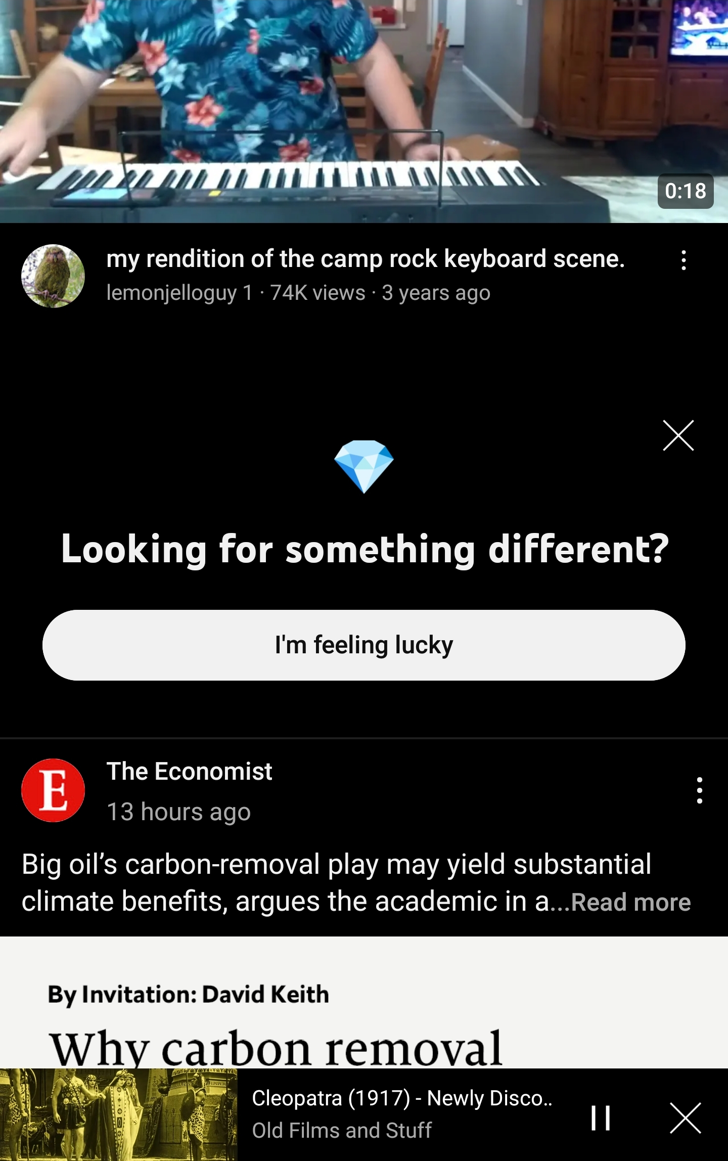
I thought you were talking about the new “I’m feeling lucky” thing they’ve been putting in my feed.
The what now?
Next time I’ll get a screenshot. It will appear in my feed and says something like “looking for something different?”
This:
0_0
Right? Some times it’s worthwhile but last time got a fucking movie trailer -_-


