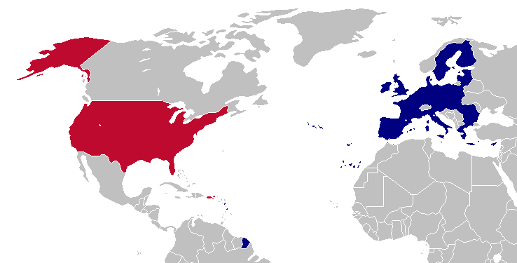
Sorry for shitty quality, but I had to compress to comply with 1mb maximum file size
At least China is on “positive color” but man, we have the classic US-Western Europe-Commonwealth in “positive color” and 2/3rds of Africa and Eurasia in “negative color”


I don’t see how this has anything to do with the currency… different countries developed differently with different initial values and various inflation fluxes along the way.
How does the result relating to Roblox mean anything? Roblox could have easily made a buck as much as a Bitcoin (cuz it doesn’t actually matter) and then the whole map would be yellow.
It’s effectively a comparison of whether 80 units of your currency is worth more or less than 1 USD.
I agree, it’s a strange metric. Japan’s unit of currency (the yen) uses the base unit effectively as the U.S. uses cents (divisions below the yen were abolished in U.S. occupation)
But that doesn’t matter because the starting metric of one currency has no obligation to be the same as another… they’re just different “units” like how 1000 meters is 1km, different units but technically the same value.
It’s arbitrary is what I’m saying.
Well, yes, that was my point bringing up Japan.