Way back at the beginning, when genAI was new and LemmyNZ had but one user, our logo was created. It’s terrible, it’s AI generated, and I hate it.

I am keen to get a new one! There’s also an option to get a new banner if that’s what people want, though people have expressed that they like the current banner.

This post is to ask for people to supply their ideas for a new logo or banner. Hopefully there are some artists out there that can help! After we have some options I will organise a vote.
Reply to this post with your suggestions or your submissions.
You must log in or register to comment.
I asked some artists and got lukewarm responses
Are there any requirements? Image aspect ratio, general content guidelines, number of penisus allowed, etc?
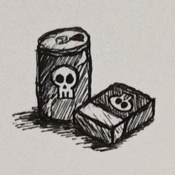
i can try to draw something but a) i am shit at drawing and b) it might take me a while to figure something out because of a).
edited to add: just an idea but maybe the banner could be a monthly community thing? like if people have nice/fun photos they have taken around the motu, or relevant art they have made, pop it into a monthly pinned thread to choose the banner for the following month?
We actually tried having a rotating banner for the c/newzealand community, but didn’t get many submissions after the first month 🙁
We can give time for you (and others) to have a play at making a logo, no rush.
Are you still looking? I’m a digital artist and illustrator by trade. I’m happy to donate something.
Let me know what the recommended dimensions are so I can make something that scales properly.
We are still looking, that would be amazing if you could do something for us!
The logo is shown at the top left of the website, as well as in different places in different apps. I think the best is to do a 1:1 square that also looks good when cut down to a rounded rectangle and when cut to a circle!
Art is fun :D

Nice! Come up with all the ones you want and we can hold a vote on which are people’s favourites!
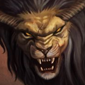
Since we’re posting art, I’d better throw own my attempt from a few weeks back:

Ok not very professional but it was one of the first times I’ve used inkscape. I was going for a lemming/kiwi hybrid.
This is great, what a charming fellow <3
Here are four icons that I’ve spun up. The originals are vectors so I can export them to any size, these are 400x400px PNG files.


Will look at possibly painting something in the future, or doing pixel art, idk. I’m using this as an excuse for me to make something fun :)
Haha nice. What was the idea with the top left, what are the squiggly lines?
The ‘glow’ of the kiwi’s laser eyes, of course! 💢
Ah I see it now! I thought it was a chicken comb and wattle…
Well now I do, too. Dang hahaha
Im on board with the size ratio, Im hoping you know what minimum pixel dimensions is needs? Eg: 128x128px
If I do a big painting it would be muddy and hard to see when shrunk small, but if I do bright pixel art it would be blurry if scaled up. If you’re not sure I might just do some kind of vector or cartoon.
It will take me a day or three but I’ll get something to you :)
The logo at the top left of the website seems to display pretty small. Seems like it might even be 30x30? Looking across various apps, it seems that the logo is typically displayed reasonably small.
I think one other consideration is that it would need to work well on both dark and light themes.
Roger that! The desktop icon is indeed 30x30 when inspected. I wasn’t sure if there was ever a large version used anywhere.
Good call on the dark/light mode though, since I often use transparency that’s important
Revenge for not being on so many world maps. Now its our turn to be the world map

That’s great! Are you still playing with ideas or should I organise a vote for adopting it as a new logo?
Art has no end, if it stayed open I’d eventually add more. But my priority is my work now, so don’t prolong it on my account.
So lets say yeah, done for now. :)