
You must log in or register to comment.
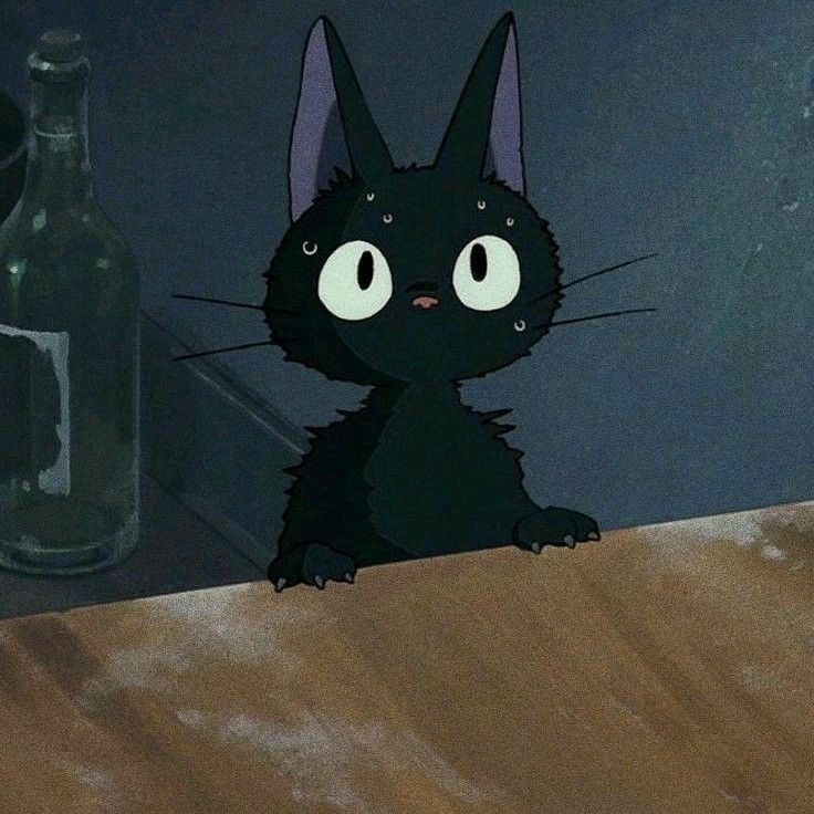
The details such as ears, whiskers, nose are way too small. They’re hardly recognisable on a mobile device, app icon wise.
I love the app but the new icon / logo not so much.
100% agree. I really enjoy the app and Kuro has done amazing work, but this logo misses the mark tbh. I’m definitely no graphics designer (just someone who knows enough to make shitty memes), but the alignment is all over the place with this logo.
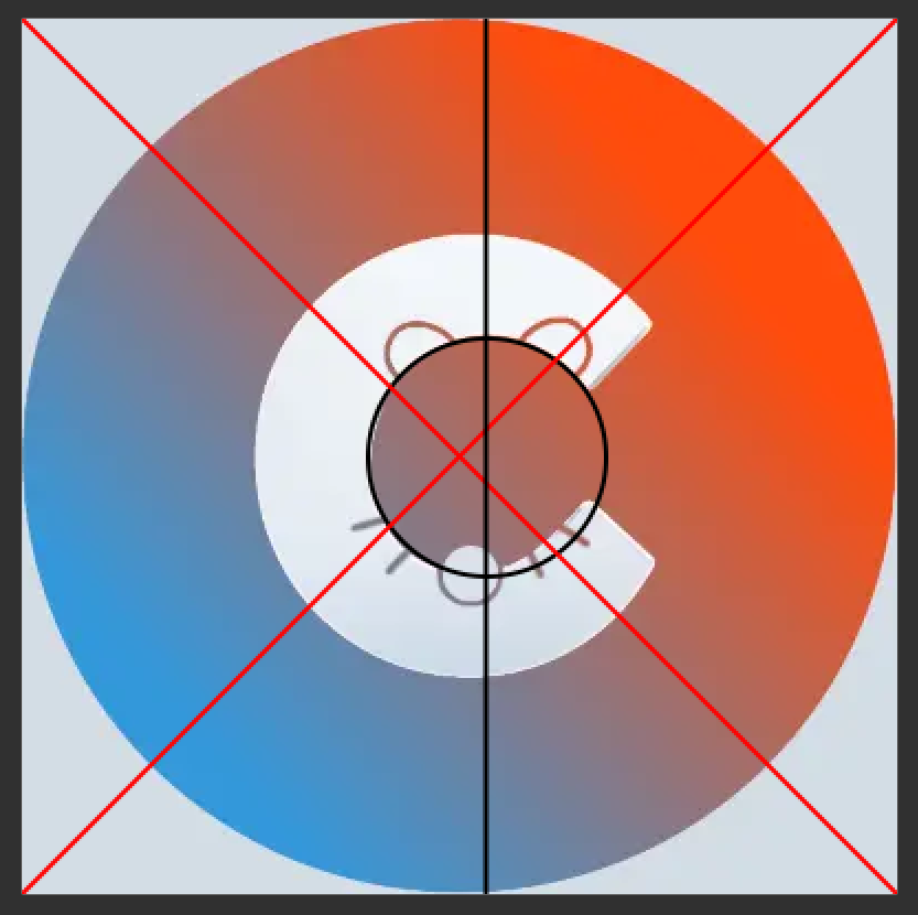
If it were centered it would be offcenter
Doing great! Also love the new logo.


